Client: Bandit Kidswear
Project: Branding
Year: 2023
Bandit Kidswear is a yet-to-launch company based in Western Canada focused on fun and bold clothing with a cheeky “tough” aesthetic for children while retaining a young look from the parent’s perspective.
The brand is aiming to appeal to a mainstream audience who are looking for clothing that is slightly unique while retaining the ease and simplicity of major brands already on the market.


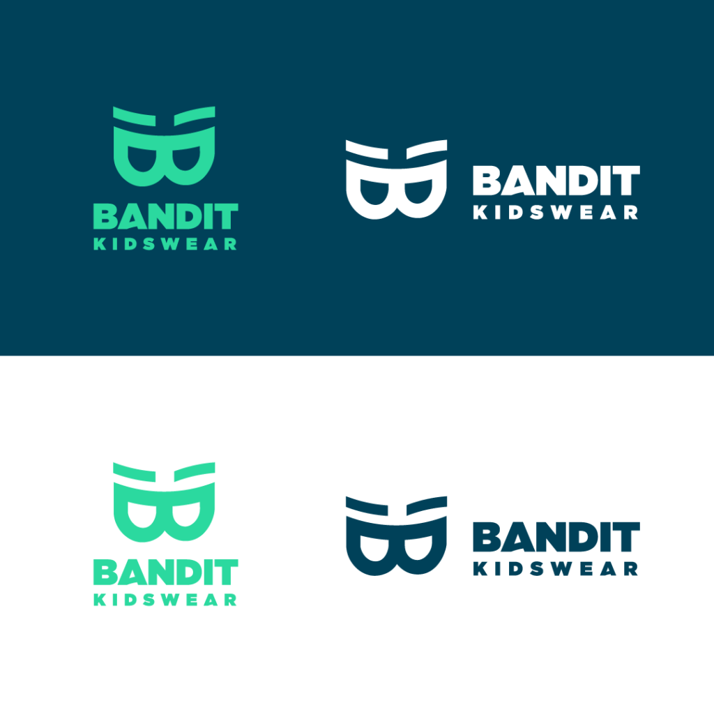
The logo is designed to represent a bandit mask while also containing the letter “B” of name. The raised eyebrow element adds the fun attitude that is part of the brands ethos.
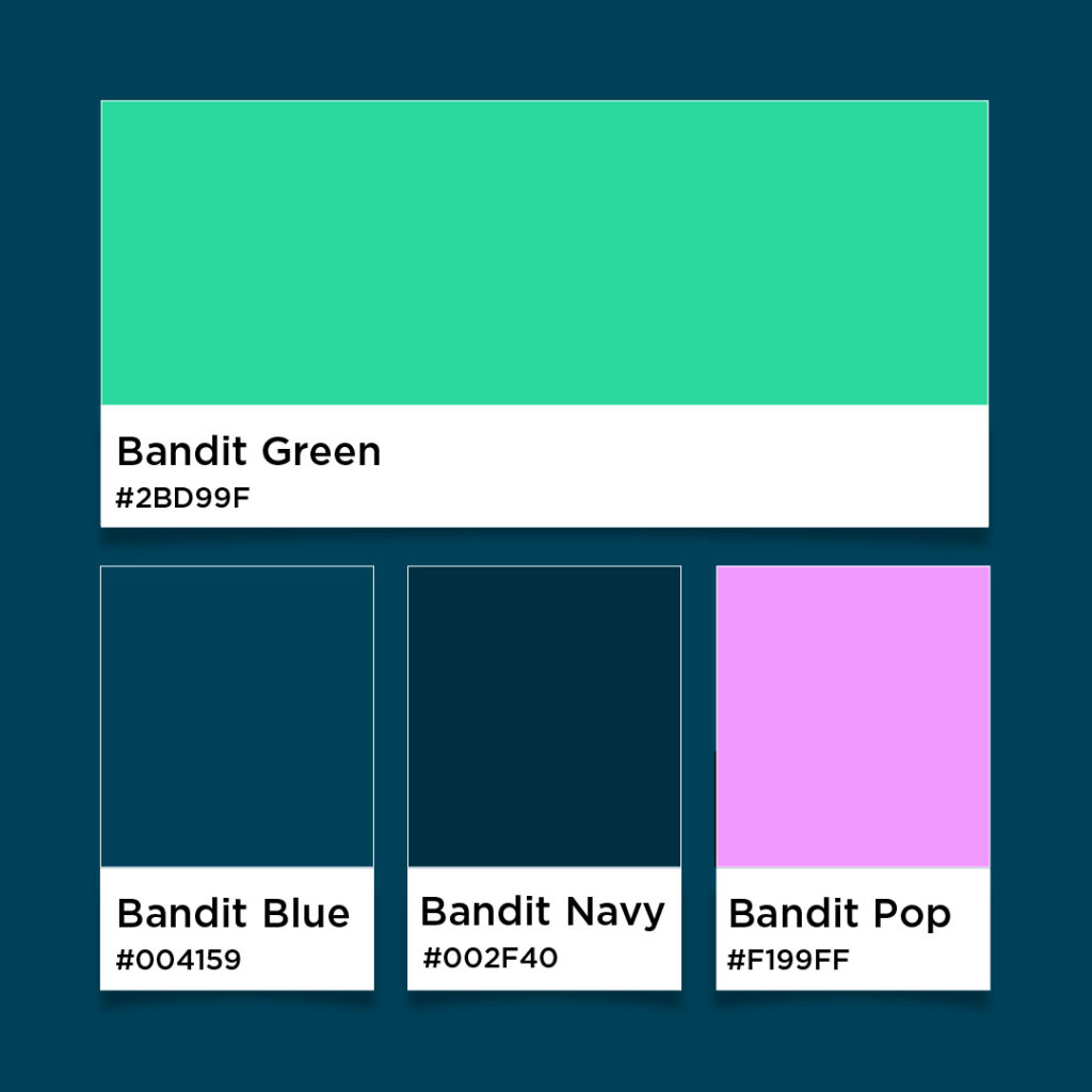
For the colours, a blue-green is paired with dark blues for a near-tonal aesthetic that is both modern and gender neutral. the contrast is high while retaining legibility. The colours are youthful without being traditionally childish.
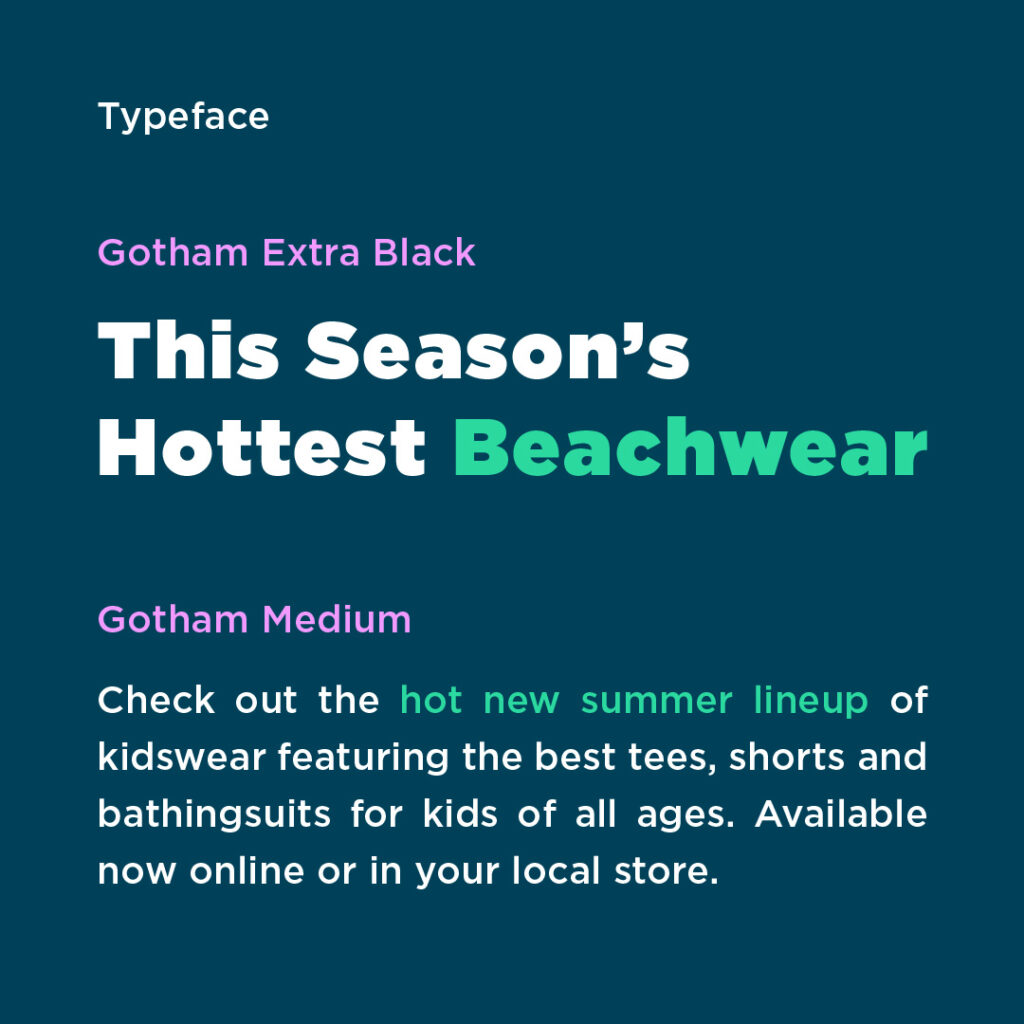
To work with the modern colour scheme, the typeface Gotham is used. For the wordmark, the Extra Black weight keeps with the bold fun feeling. The letter A has been modified to add a small point of difference – a concept also used in the clothing designs themselves.

