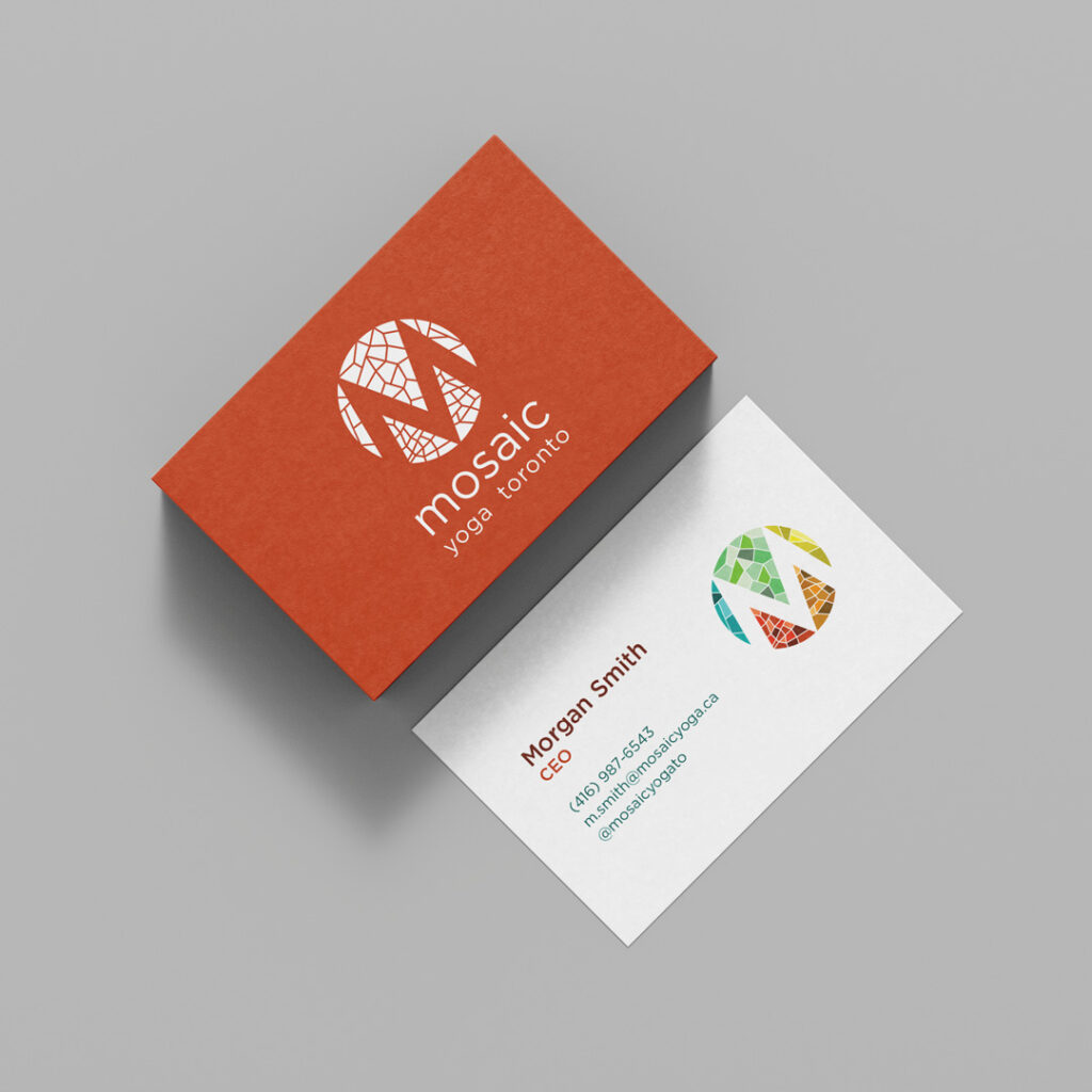
Client: Mosaic Yoga Toronto Project: Logo Design Year: 2017
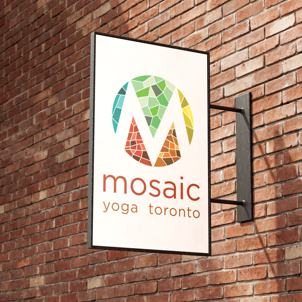
Mosaic Yoga, the incredible yoga studios in Toronto, Ontario needed a logo that represented their mission of providing an inclusive and inviting space for all.
Using fragmented shapes to form the negative space around the letter M represents the name Mosaic while the multi-coloured areas and circle represent the inclusivity of the brand.
The type is set in lowercase Gotham Book for a timeless and welcoming appeal. It is also a balanced and strong typeface, reinforcing two important elements of yoga.
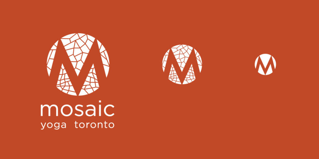
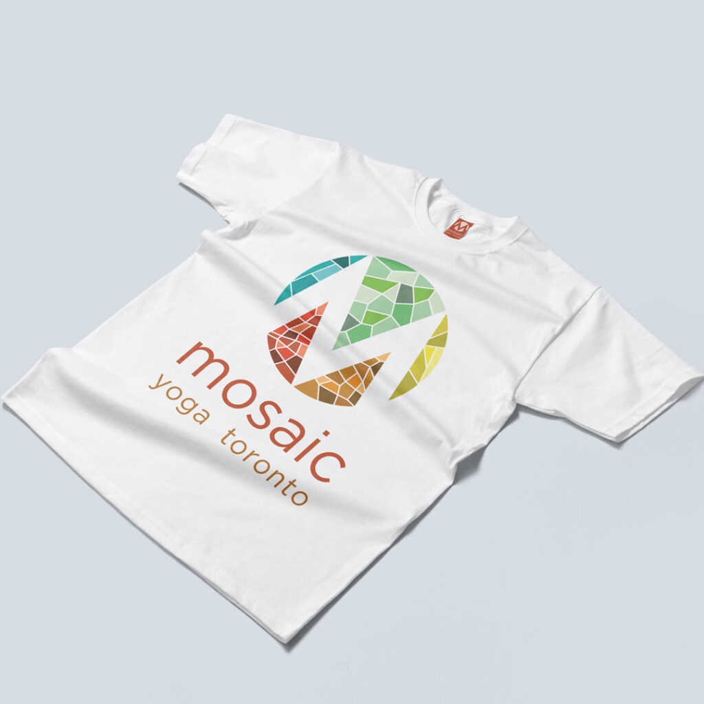
Despite the numerous colours and detail in this design, it is still highly scalable making for a versatile logo. It can be simplified in numerous ways while retaining the brand identity and recognition.
This design mentality ensures the logo functions in all applications ranging from large scale printing for signs, posters and merchandise; to smaller, more limited applications such as the submark shown here used as a favicon.